We’re thrilled to unveil the new logo
for Rebound Ace!
Our updated design reflects the innovation, energy, and performance that Rebound Ace systems bring to athletic surfaces around the world. The fresh, modern look of the new logo is in line with our commitment to providing high-quality, durable surfaces that support athletes at every level. While the logo may be new, Rebound Ace remains the same trusted brand known for delivering premium cushioning, exceptional durability, and consistent playability.

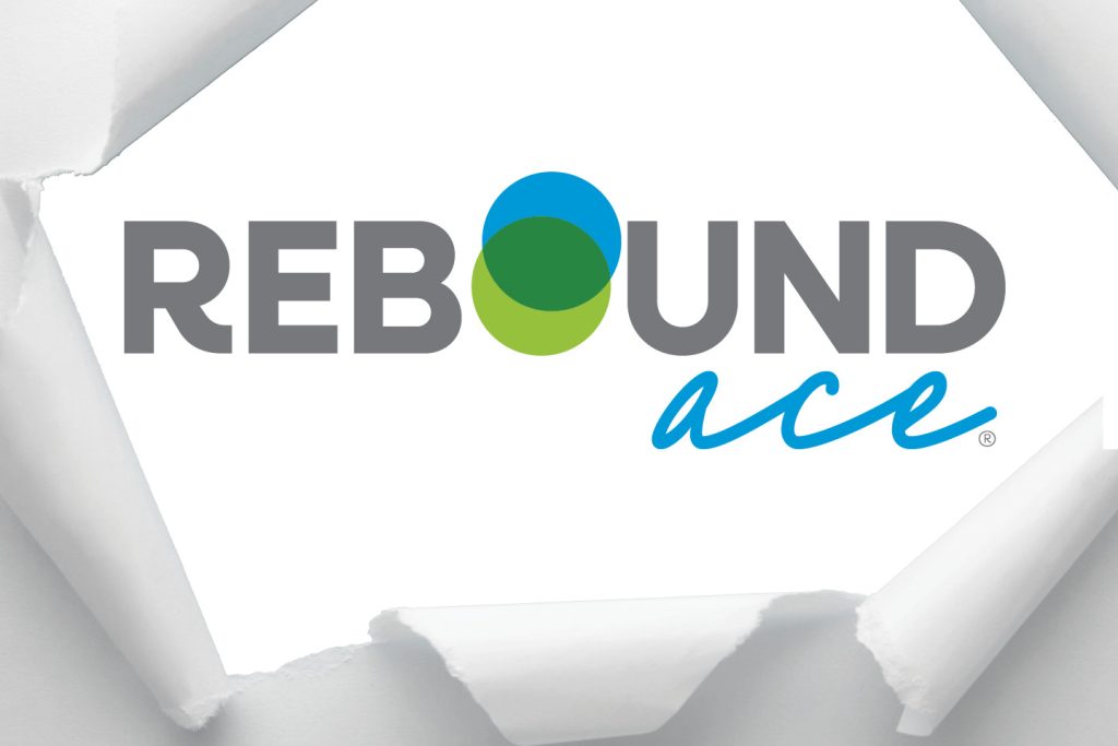
The logo’s fresh blue and green circles overlap to symbolize the dynamic balance of cushioning and support that Rebound Ace surfaces provide. The green, a direct connection to the iconic CSS logo, ties Rebound Ace to our legacy of quality and performance.
With this new logo, we’re celebrating the essence of Rebound Ace—dedicated to delivering surfaces that are as vibrant, reliable, and enduring as the athletes who play on them. We’re excited to move forward with this new look, symbolizing our dedication to evolving and improving to meet the needs of today’s players, installers, and facility managers.


